code • information design • art direction
USA for UNHCR Dashboard Guide
At my current work, USA for UNHCR, we display data all the time; we generate reports, we draw things, we sketch our ideas. The action to bring abstract relations and concepts to life help us:-
To compare things
-
To organize and group
-
To spot details
- To learn
Data visualization aims to give its readers and audiences a chance to understand data in a way that enhances our cognitive skills; since we have a vast number of data sources, the idea is to help teams internally with automated dashboards, published on our Civis hosting platform using Tableau.
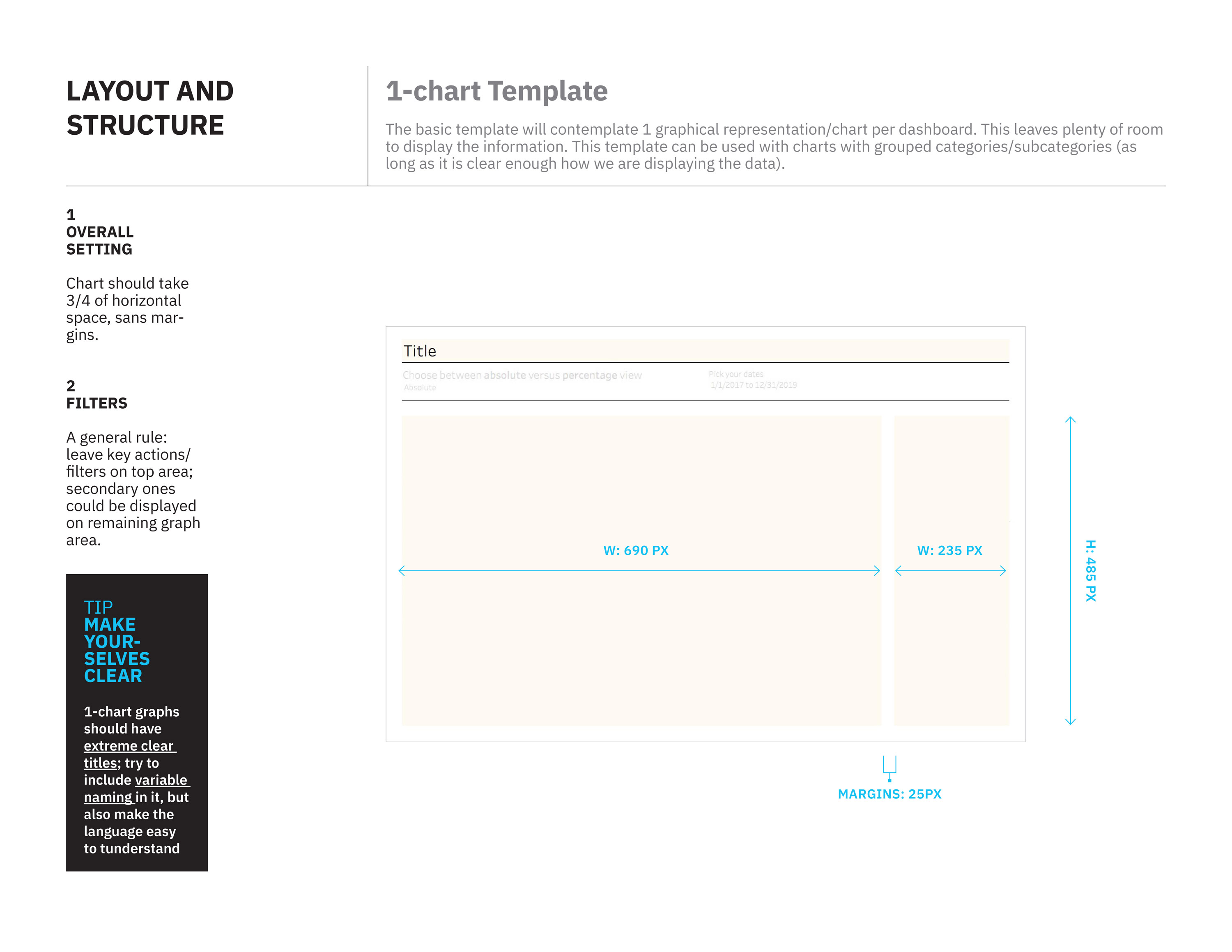
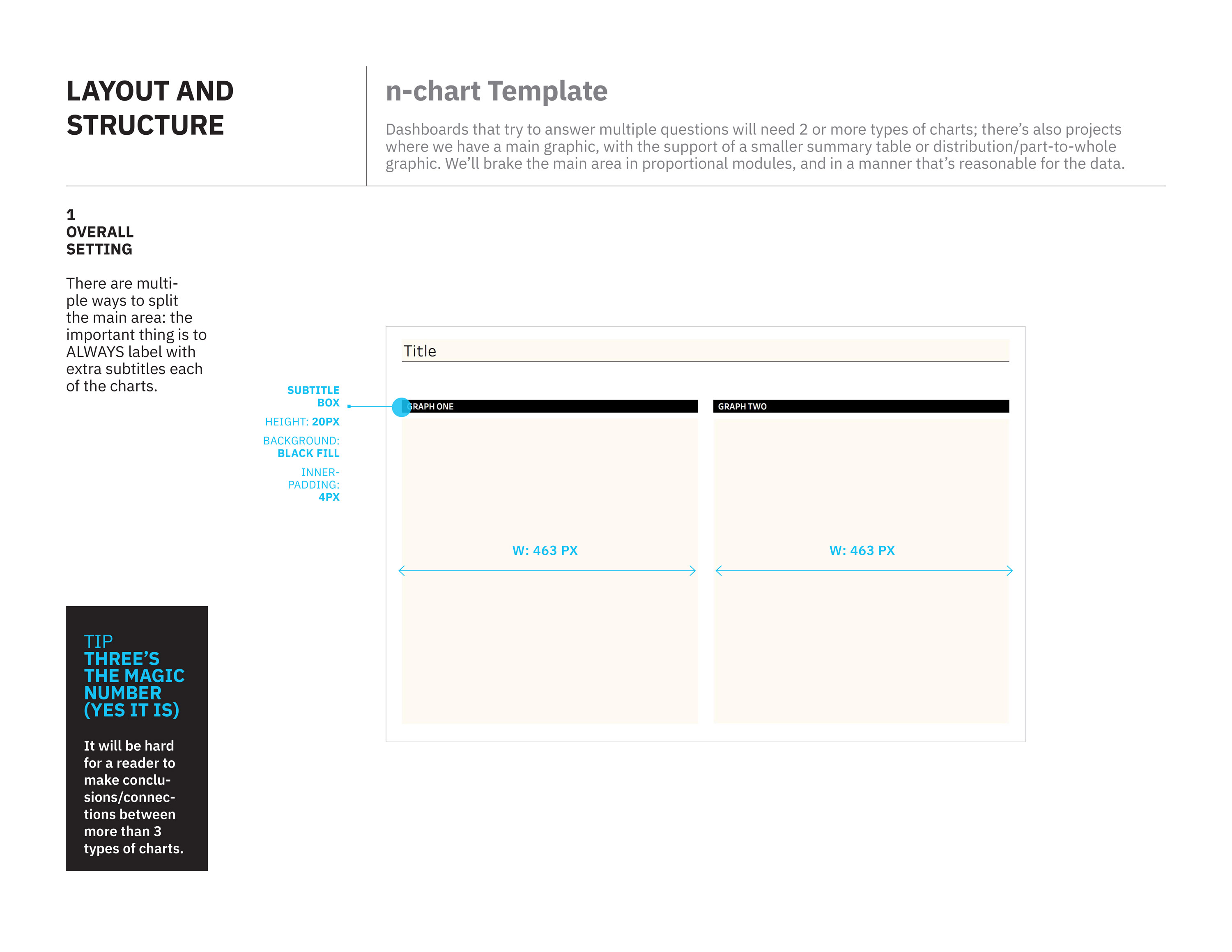
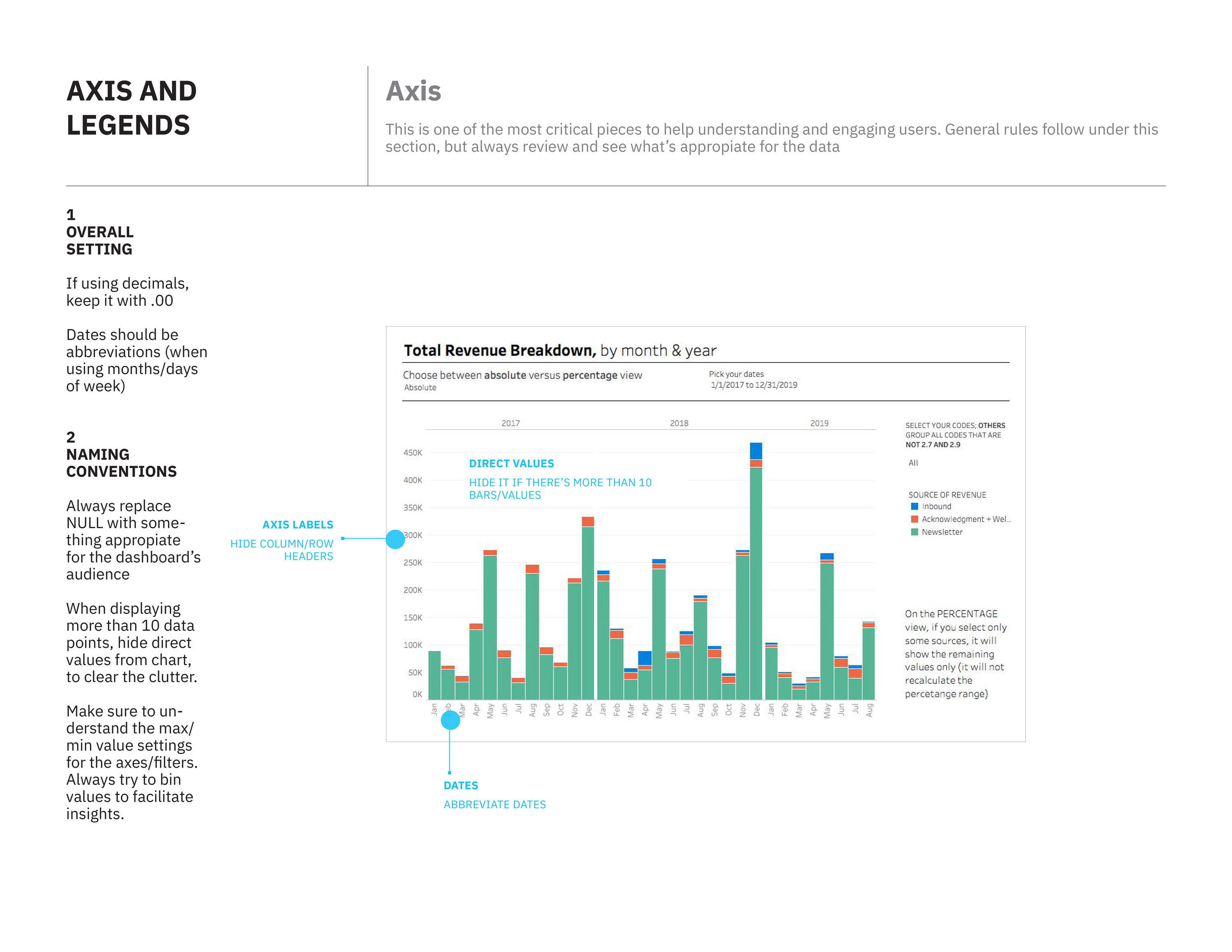
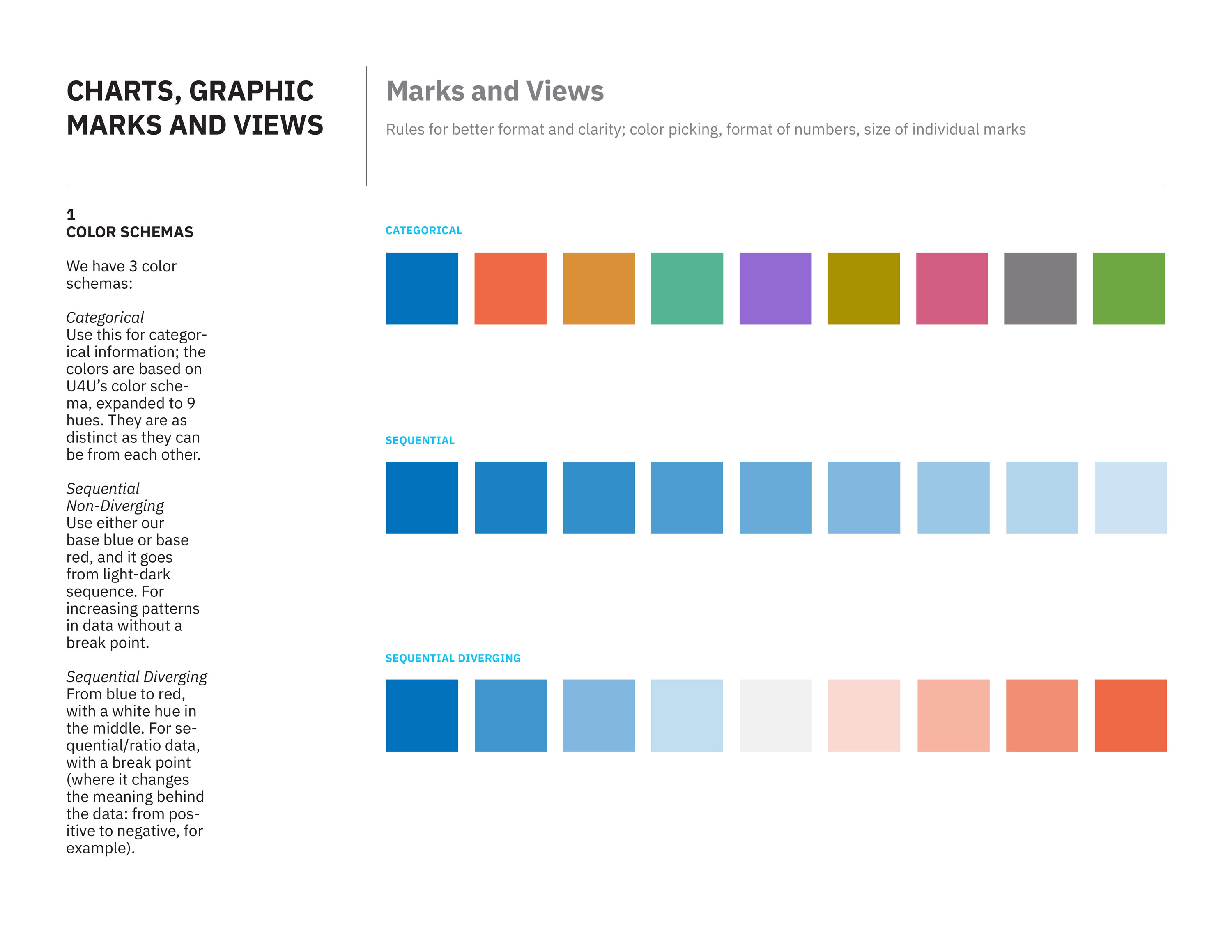
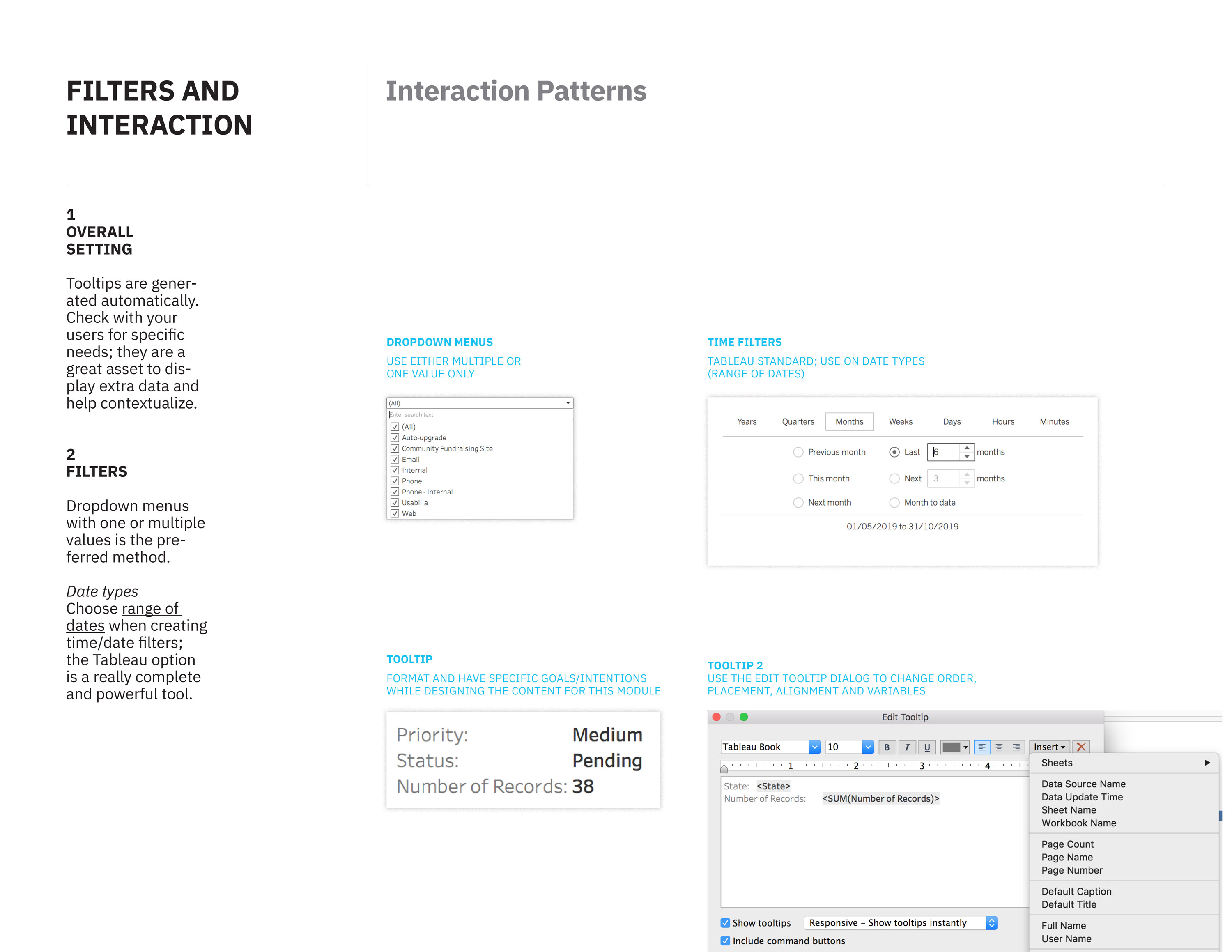
I’ve worked on a series of template and visual guidelines for Tableau for our team, The Hive. The main goal is to achieve visual harmony between multiple reports, clear definitions on naming and interactive conventions, while maintaining the look and feel of the organization.
Pages from guidelines document


Roles
- Design: Developed studies on all details of graphic representation: charts, axis, marks, naming conventions. Developed a typographic system focused on maximizing the meaning and features of specific reports. Created conventions on what are the proper charts for specific types of data. Developed layout structures for ease of deployment of different types of charts on one view.
- Tableau: Validated visual and UI/UX features on Tableau’s tech stack; developed templates and mapped out the recommendations from our documentation to steps in Tableau’s UI.
Work in progress