code • information design • art direction
How are things over there?
A spreadsheet with the question above invited ad people to write about their work experiences in Brazilian advertising agencies. The informal survey went viral – in less than 10 days, there were more than 2,200 responses – revealing the reality inside the agencies.
With this data (generated by open questions anonymously), I’ve partnered with Wonderboom, a Brazilian agency, to create an interactive page displaying the biggest takeaways from the answers.
Here’s a link to the project.
We focused on using a mix of type-heavy layout and charts, focusing on citations for granular details, but summarized quantitative charts displaying trends.
Full screen version of site
Mobile version
Roles
- Coding: front-end and interactivity. Done with vanilla JS, Flexbox, D3.
- Art direction and design.
Team
- Wonderboom (https://wonderboom.cc/)
- Fernanda Didini (https://fdidini.com)
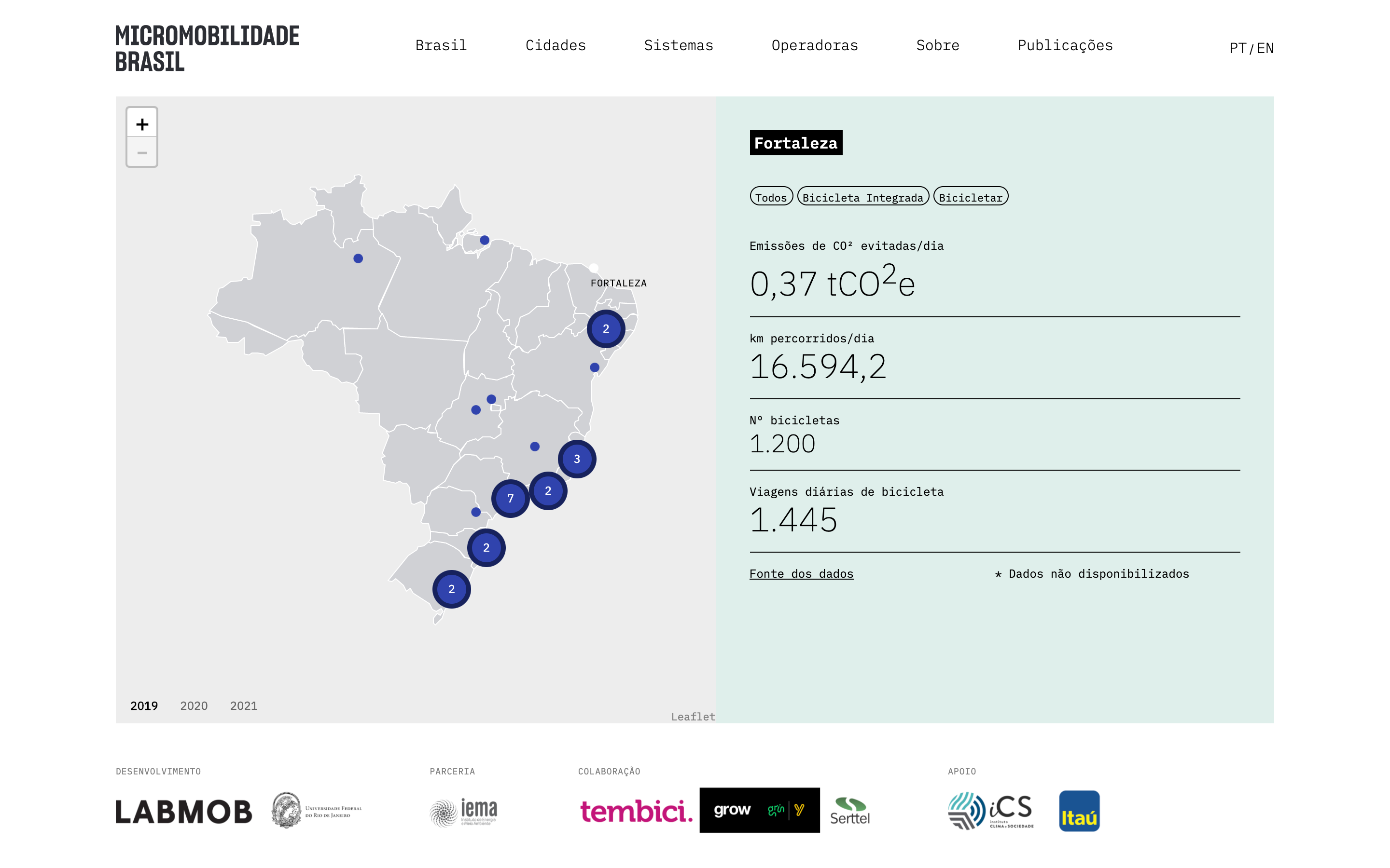
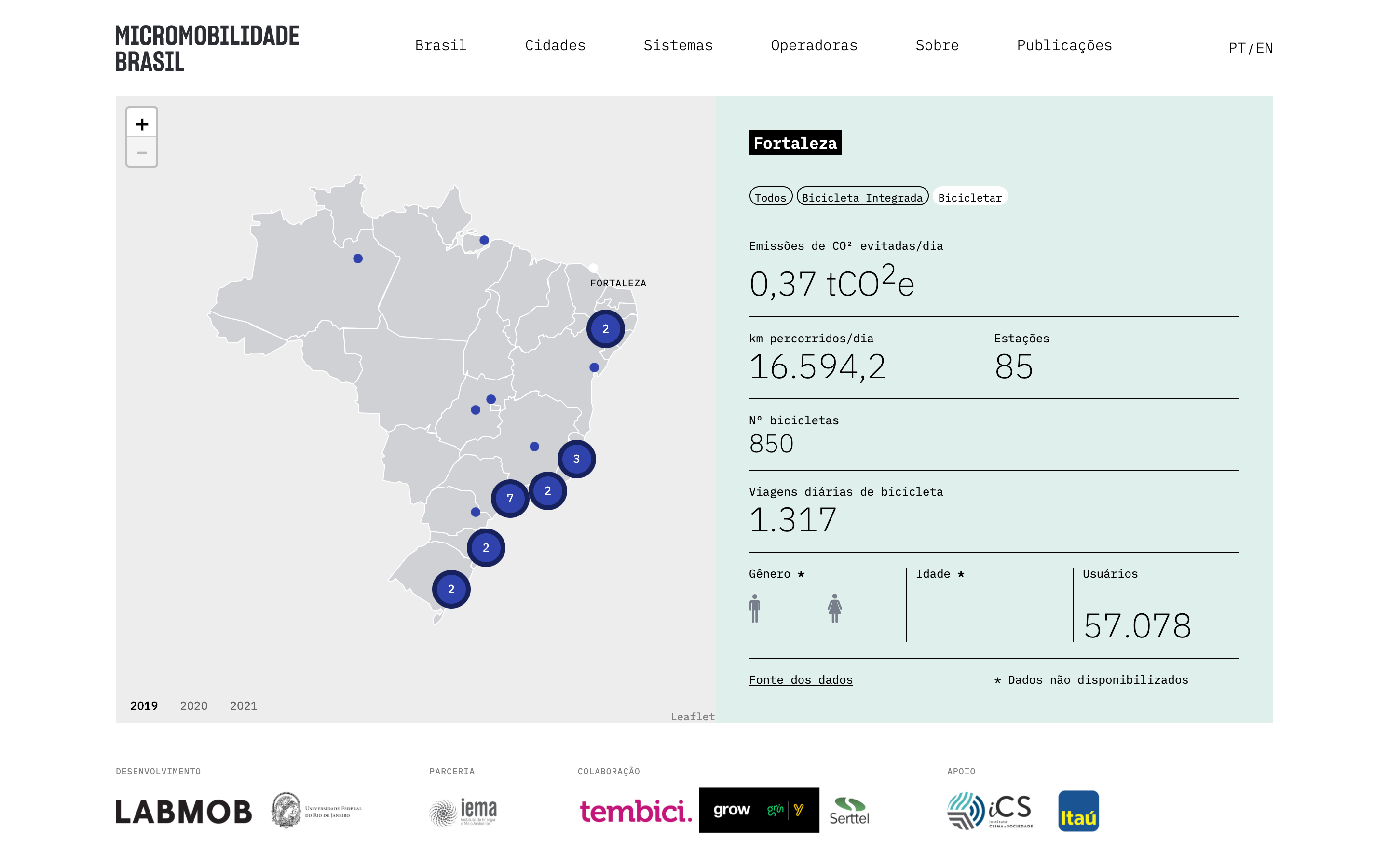
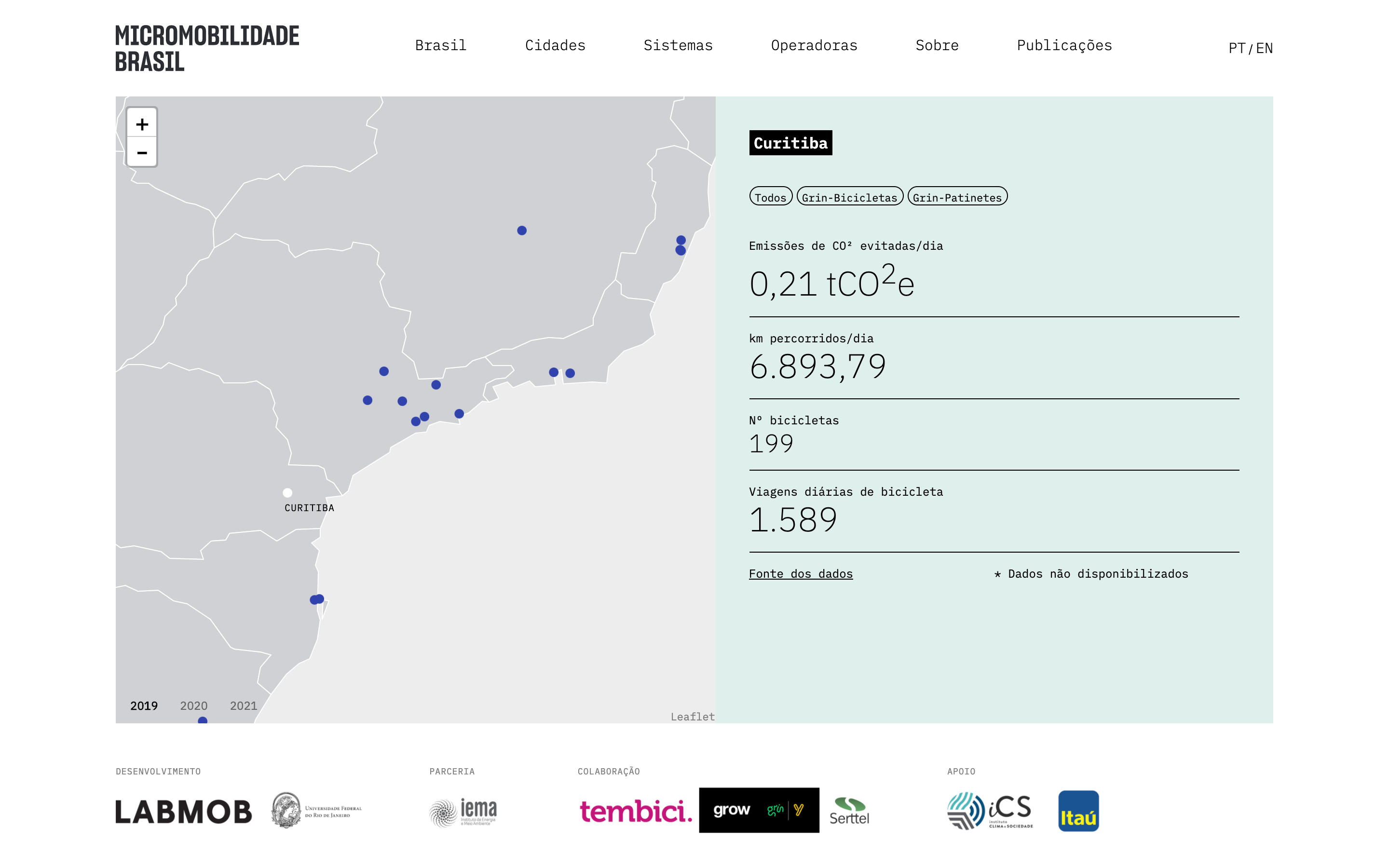
Micro-mobility Brazil Platform
The Micro-mobility Brazil Platform is coordinated by the Sustainable Mobility Laboratory [Laboratório de Mobilidade Sustentável] (LABMOB) from the Federal University of Rio de Janeiro (UFRJ) with support from the Climate and Society Institute [InstitutoClima e Sociedade] (iCS) and performed in partnership with the Institute for Energy and Environment (IEMA). The Platform’s objectives are to map public micro-mobility systems, to promote data transparency, and to quantify CO² savings.I’ve worked on the project website – the whole front-end – with the visual and creative coordination of Estudio Nono in Brazil. Website
Screenshots

App in use
Roles
- Coding: the whole front-end and interactivity. Done with vanilla JS, Flexbox, D3 and Leaflet. Also developed a system for the researchers to convert/automate manual XLS sheets to JSON files read statically by the website using a Jupyter Notebook.
- Visual adaptation: worked closely with the studio to develop their sketches into what could be achieved with HTML/CSS technologies. Also developed most of the UX/UI details regarding the main interactive pieces, such as how the map technology would work, and also how the app state work between inputs from the user.
Team
- Estudio Nono (https://www.estudionono.com.br/)
- Labmob (https://en.labmob.org/)
USA for UNHCR Dashboard Guide
At my current work, USA for UNHCR, we display data all the time; we generate reports, we draw things, we sketch our ideas. The action to bring abstract relations and concepts to life help us:-
To compare things
-
To organize and group
-
To spot details
- To learn
Data visualization aims to give its readers and audiences a chance to understand data in a way that enhances our cognitive skills; since we have a vast number of data sources, the idea is to help teams internally with automated dashboards, published on our Civis hosting platform using Tableau.
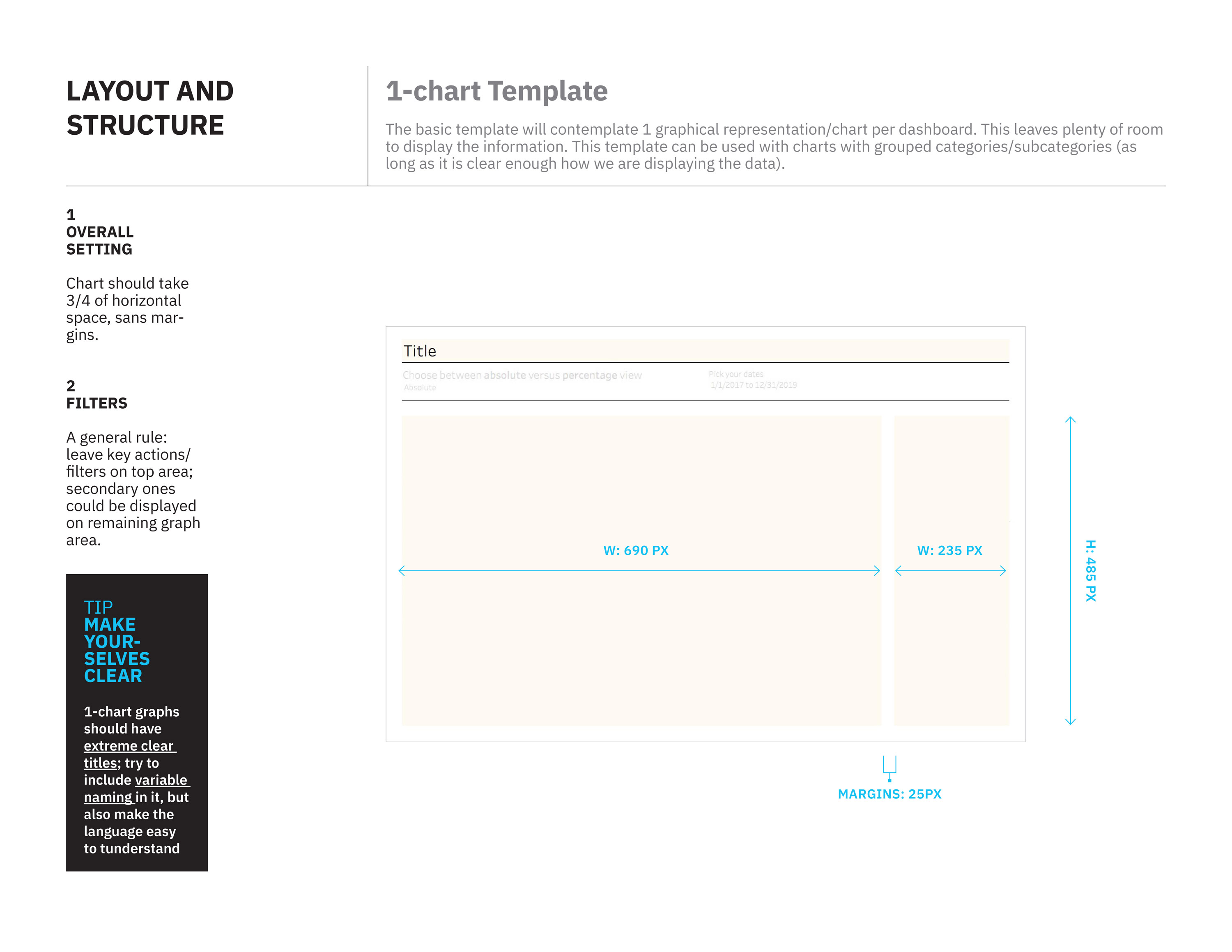
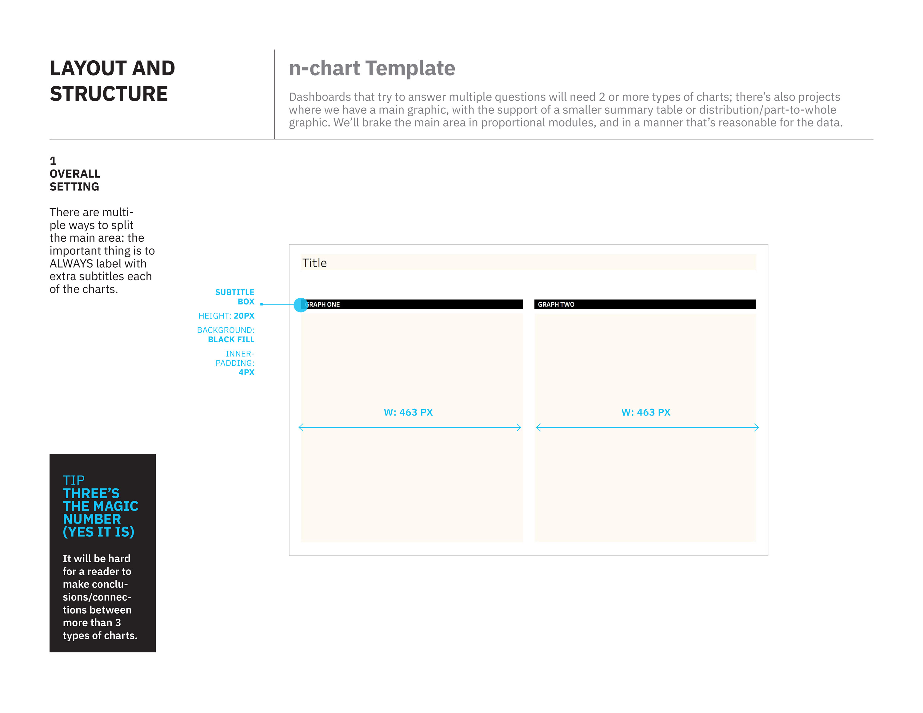
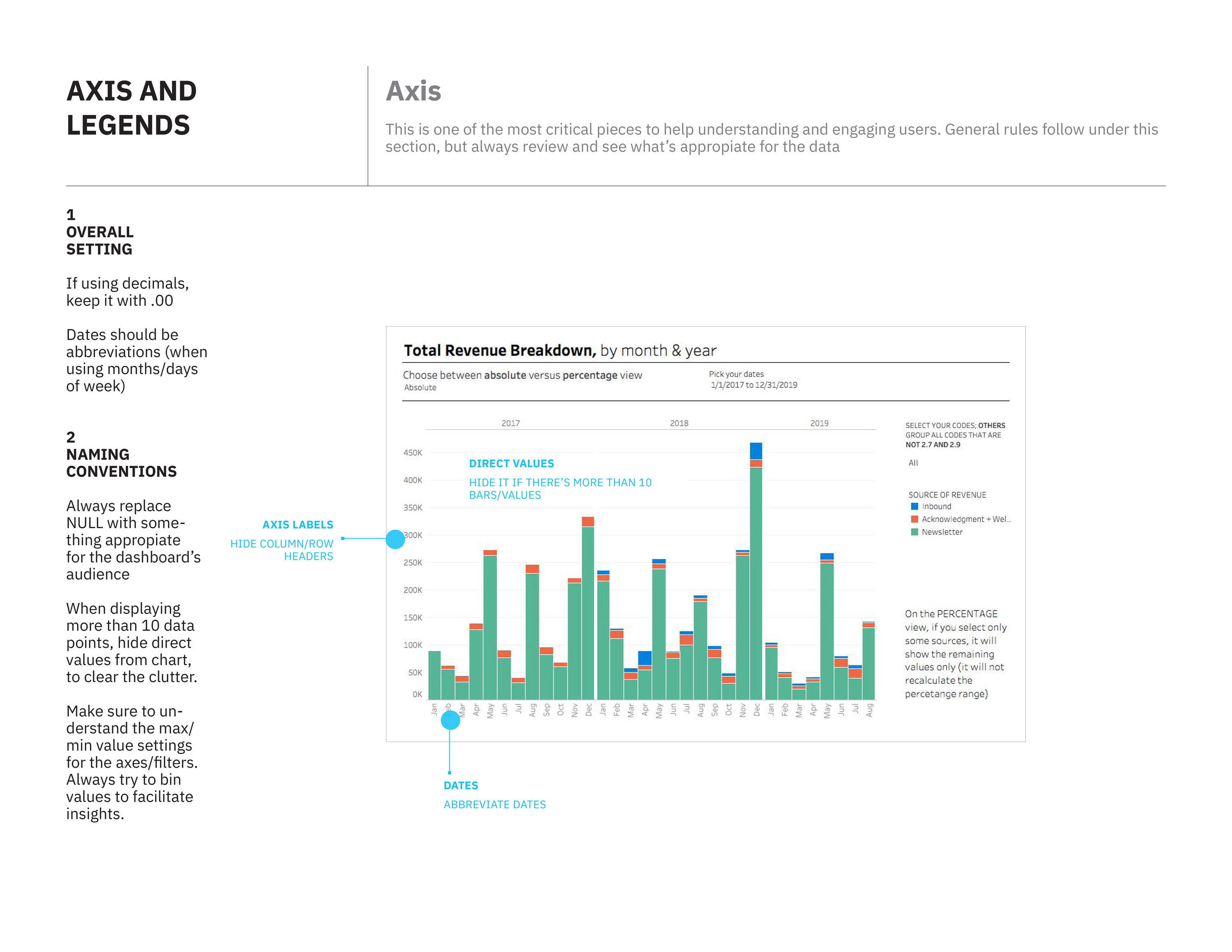
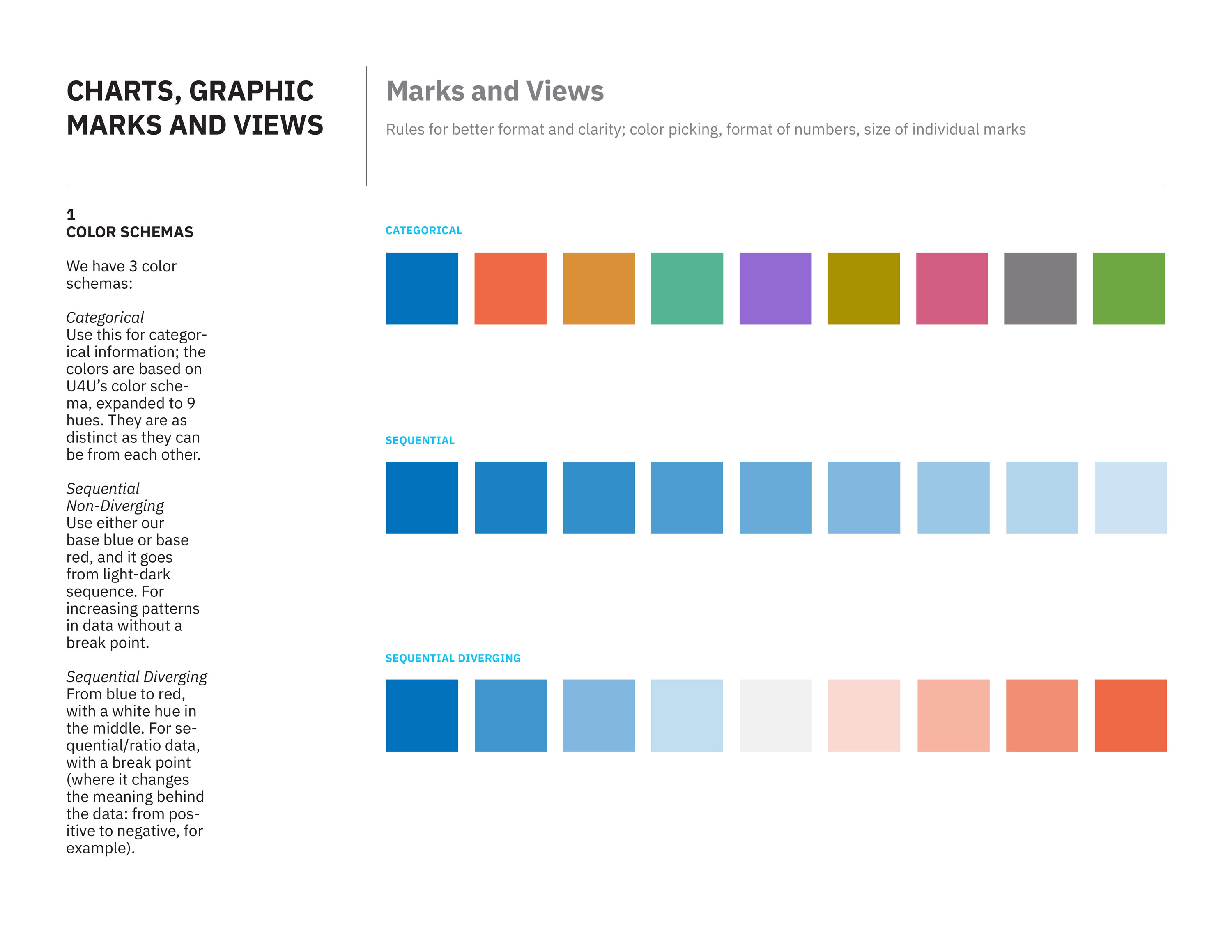
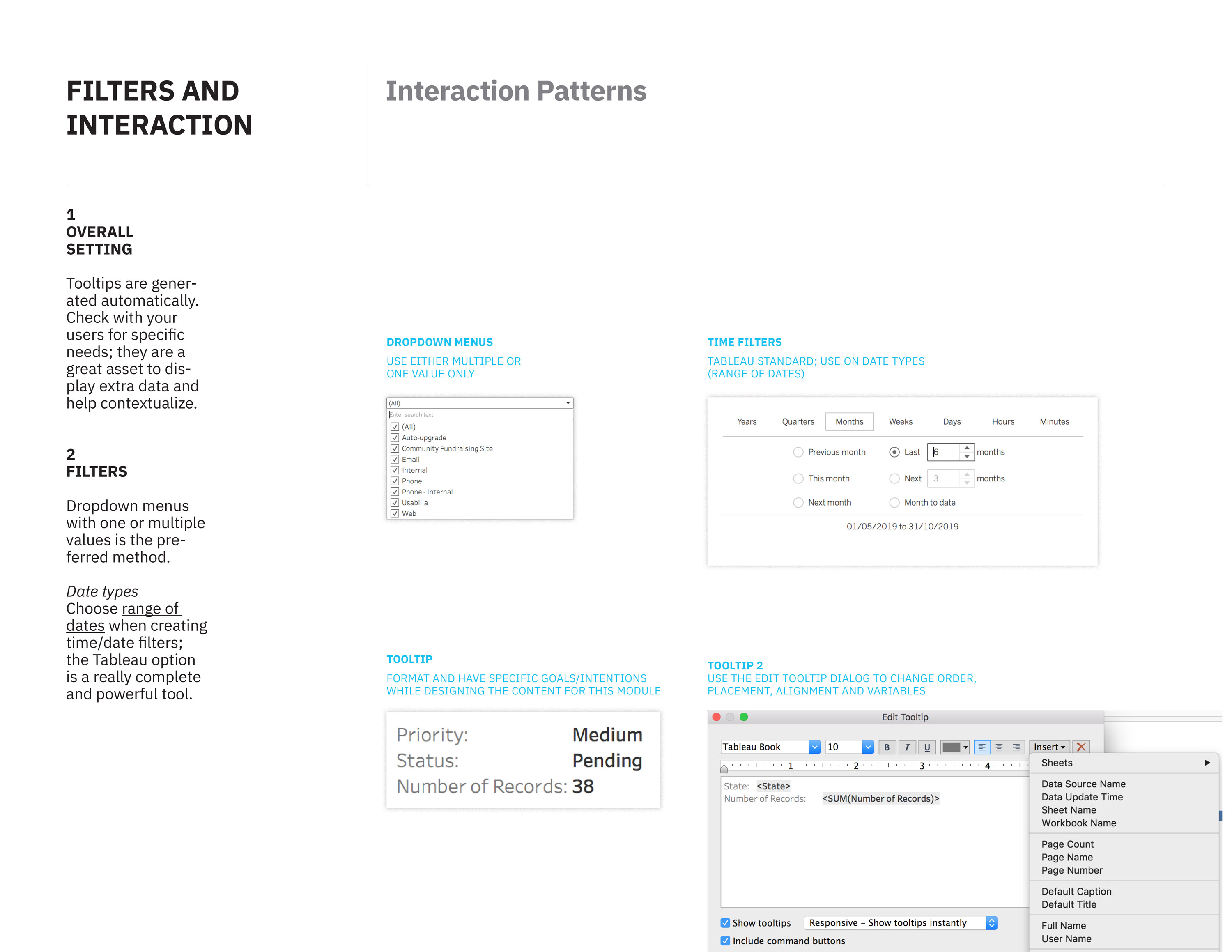
I’ve worked on a series of template and visual guidelines for Tableau for our team, The Hive. The main goal is to achieve visual harmony between multiple reports, clear definitions on naming and interactive conventions, while maintaining the look and feel of the organization.
Pages from guidelines document


Roles
- Design: Developed studies on all details of graphic representation: charts, axis, marks, naming conventions. Developed a typographic system focused on maximizing the meaning and features of specific reports. Created conventions on what are the proper charts for specific types of data. Developed layout structures for ease of deployment of different types of charts on one view.
- Tableau: Validated visual and UI/UX features on Tableau’s tech stack; developed templates and mapped out the recommendations from our documentation to steps in Tableau’s UI.
Work in progress
Cities #WithRefugees
As the data visualization designer at USA for UNHCR (the fundraising/awareness arm of UNHCR in the United States), I was part of a team that created the concept for this piece: a data piece that shows total funds raised in specific cities in the US, and how much this money is able to support refugees with specific objects and funds. Website
Demo animation of the project
3d assets by Marcus Penna
Roles
-
Creation of concept (feasibility of data assets, finding the right message, coming up with the visual metaphors): done together with rest of the team
-
Coding: mainly took care of all styling of elements. Worked on the main app (figuring out the logic behind the random array parser) together with team; debugged and worked to figure out some small kinks between the modules and Webpack configuration
- Art direction: worked closely with the illustrator responsible for the 3d assets we're loading with the three.js library (still figuring out some texture issues).
Team
- Gabriel Gianordoli (http://gianordoli.com)
- Jieqian Zhang (https://jieqianzhang.github.io)
-
Marcus Penna (https://www.behance.net/marcuspenna)
Work in progress
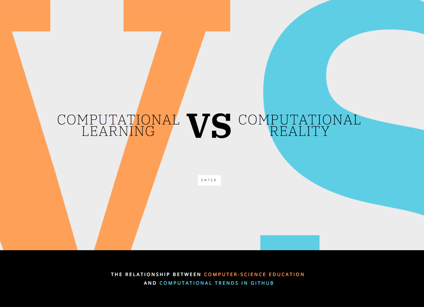
Computational Learning
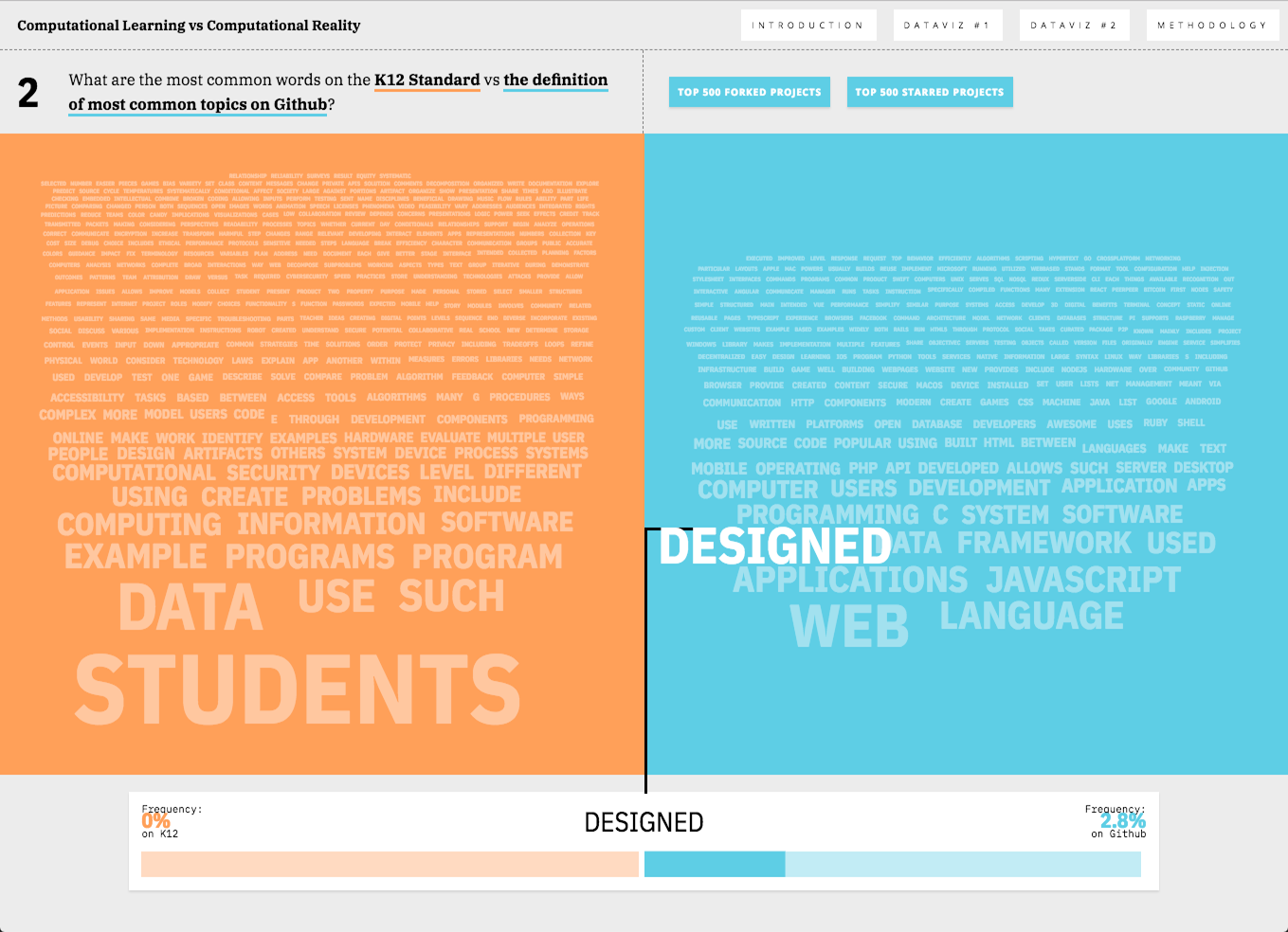
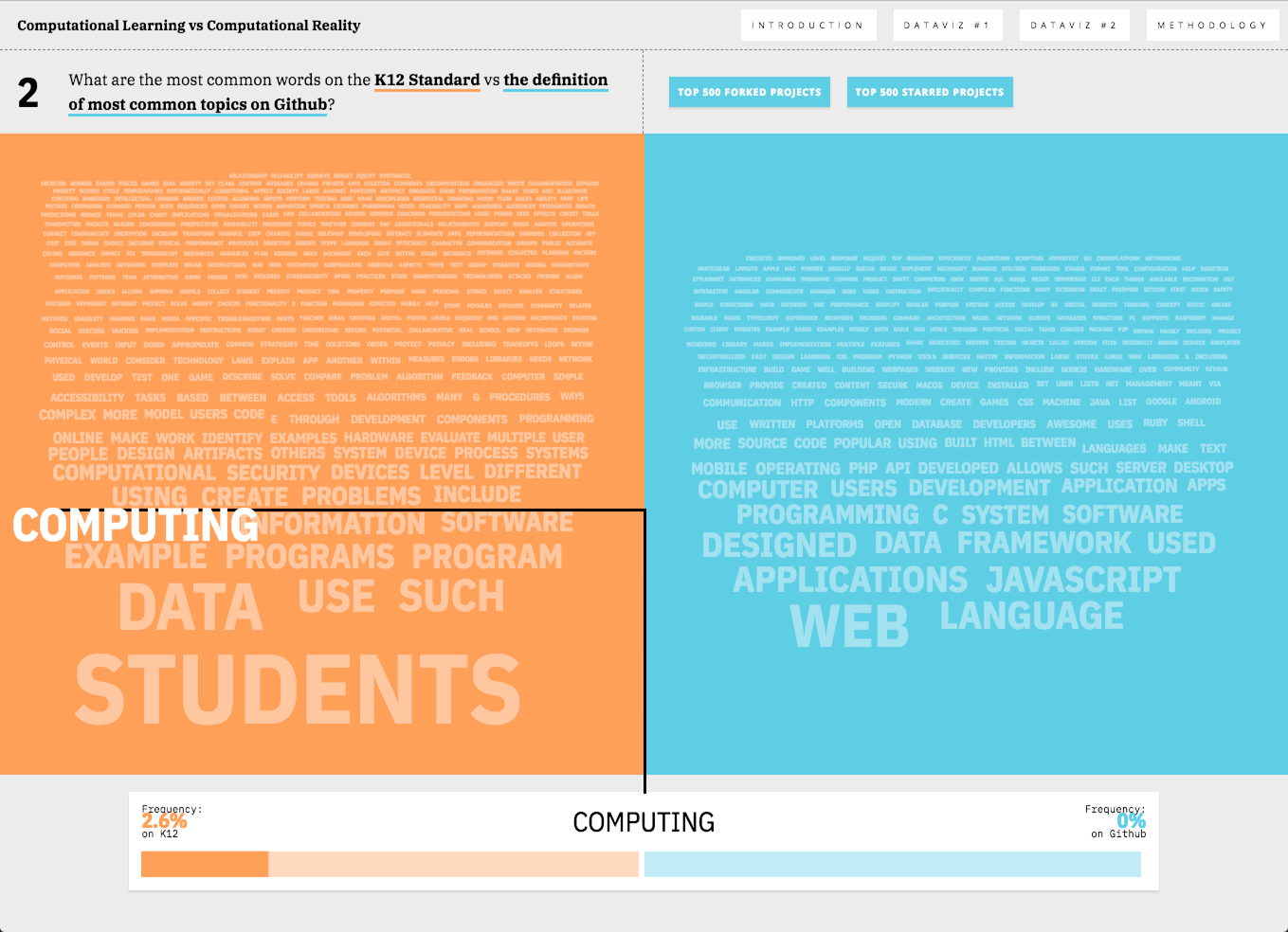
Final thesis for the degree of Master Science in Data Visualization at Parsons School of Design. This was an experiment on visualizing similarities and differences between how children are taught coding and programming and trend-like concepts, like Github topics. Data was retrieved from Github API with Javascript, formatted and then displayed with a custom D3 word-cloud/dashboard. Website


V1 Repository
Written thesis
Abstract
The relationship between computer-science education and computational trends in Github
Teaching children how to code is a common goal in education in the US. Initiatives by the public and private sectors – such as code.org and CSforAll – are trying to address this with extensive funding and recommendations for courses and syllabi.But the long-term objectives of such initiatives are not clear. Will they create better citzens and more informed students? Or are they focused on a more productive workforce? These different agendas need to be aligned with concrete paths for the children and also juxtaposed with their professional and lived experience.
Based on CSTA K 12 Computer Science Standards, and Github repositories as proxies for applied computer science, this visualization shows gaps and opportunities on both sides.