code • information design • art direction
UNDP report and word frequency
GitHub live linkUN has developed a report on how to tackle inequality in SubSaharan Africa. The geographical focus is peculiar, but it serves a purpose: most of the countries on that region are the ones leading the GINI ranking on inequality. The report is divided into several chapters, each one dealing with specific themes and problems within economic and socio-politic issues and boundaries.
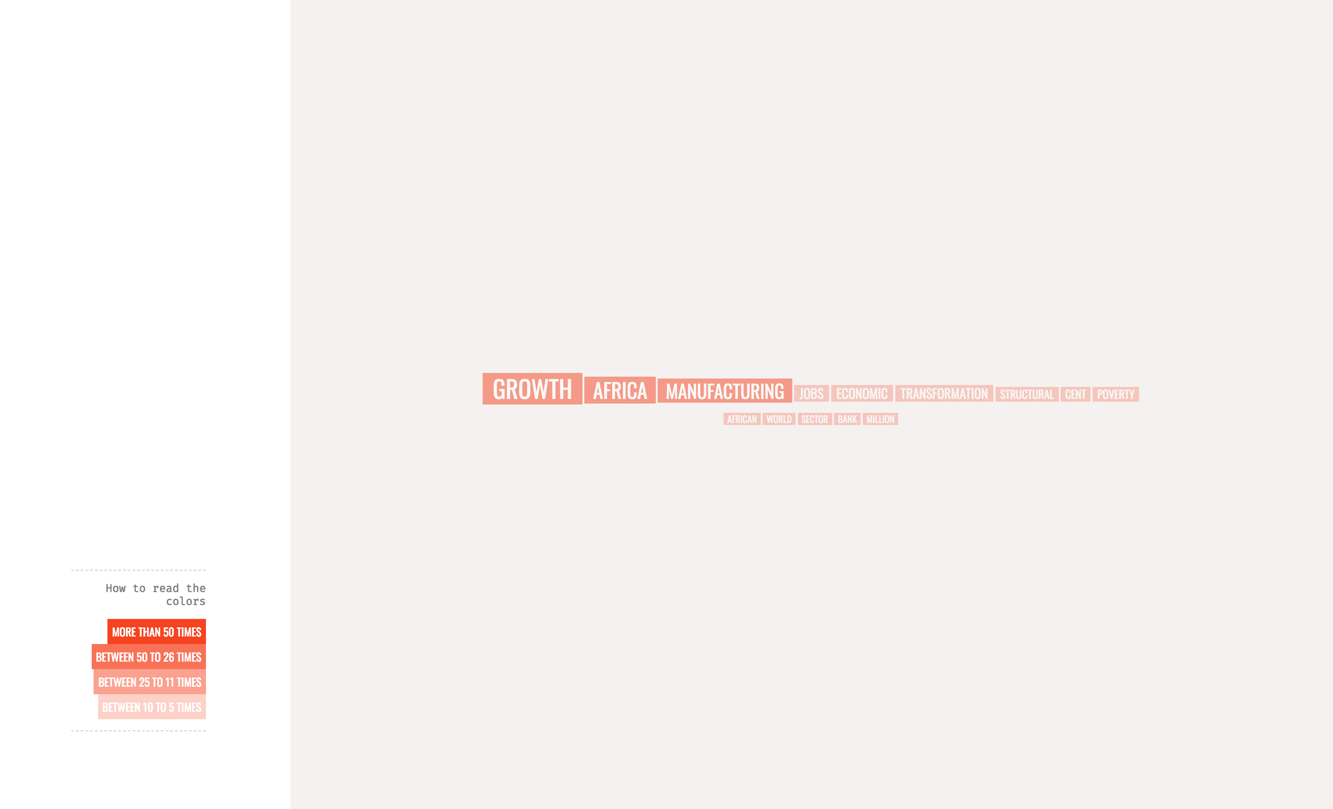
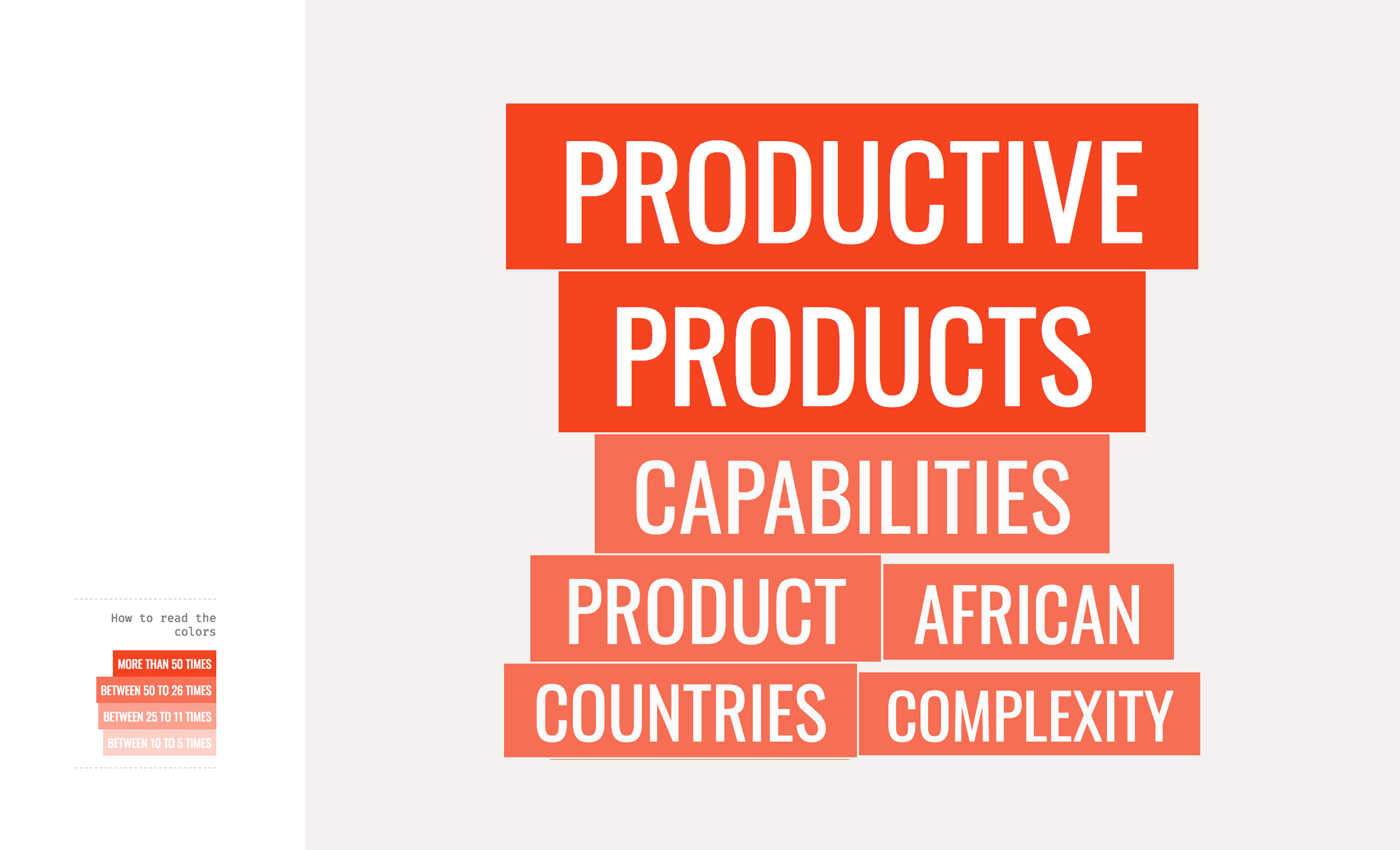
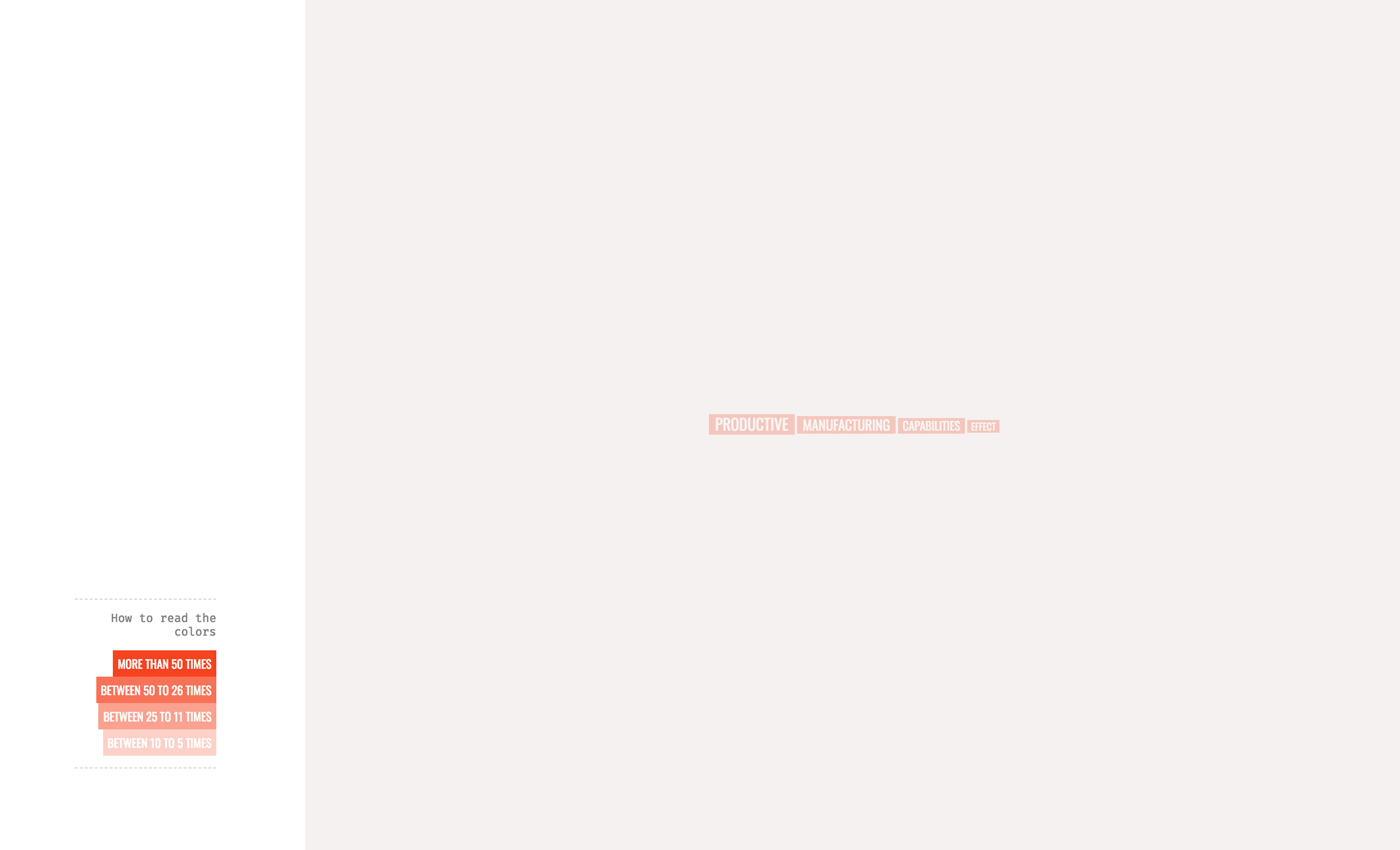
The fifth chapter provides us with two difficult tasks. 1. How to develop a better economical model for the selected countries regarding the scope and complexity of their companies and assets. 2. And how to parse this information into guidelines and polices.
To get a better understanding, we can break this document into its subchapters and try to understand the terms, as a way to insert us into complex methodologies and graphs.


How this work was done
Each word in these word bubbles was sized to its frequency in each paragraph. Their colors show in which range they fall. Common words such as pronouns and articles, and also years/reference numbers, were removed with Javascript. The visualization was rendered with D3.
Assignment for Major Studio 01 - Parsons 2017.