code • information design • art direction
What does the economic complexity index look like near GDP per capita and GINI?
GitHub live linkThis is a project to focus on how to develop African economies (with all its weakness and strenghs). The Economic Complexity Index is chosen as a tool to understand sub-Saharan countries. But the ECI is complex: it tries to assess how the economy of a country is developed and its potential to breach into other areas of economic activity.
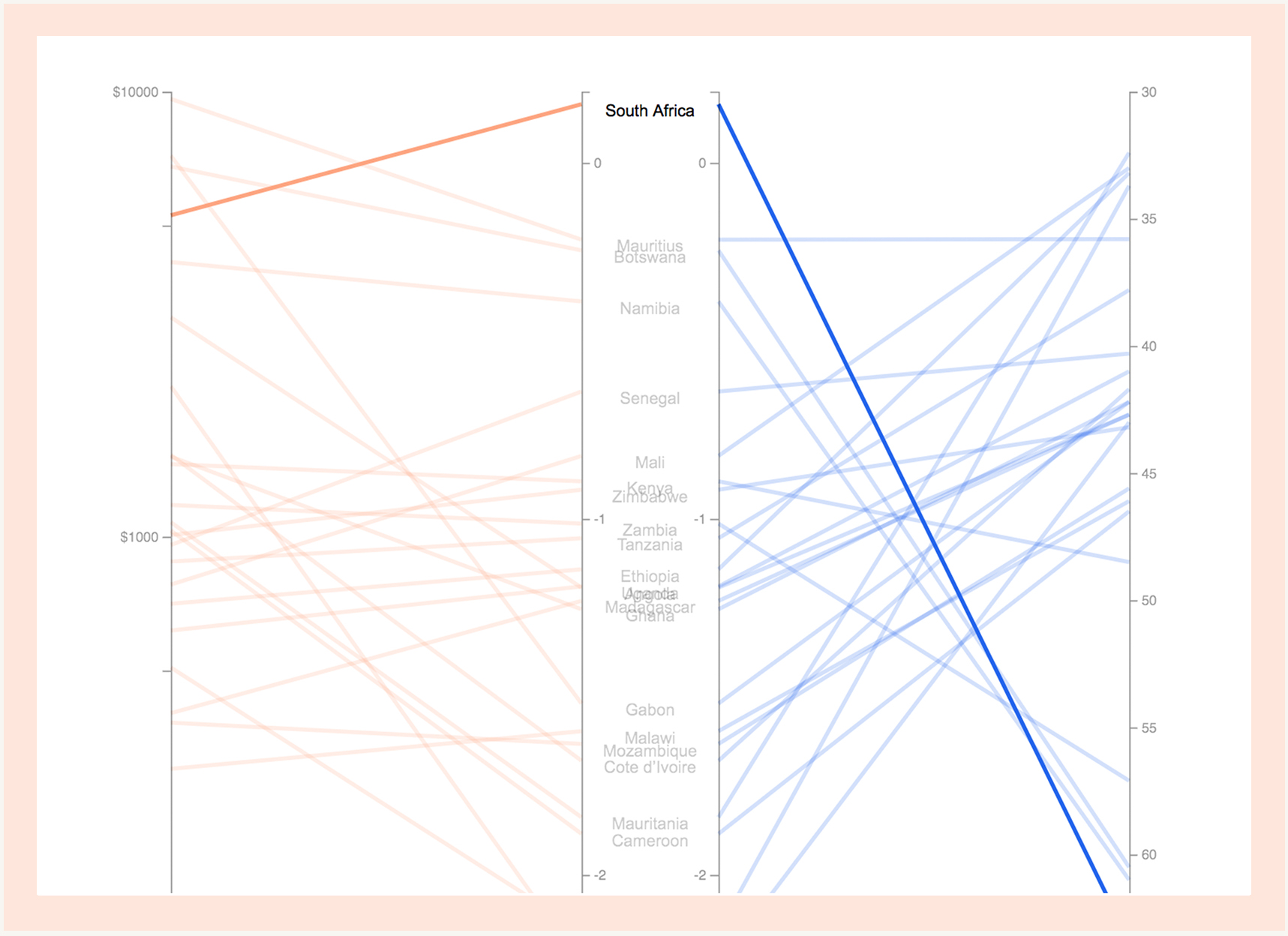
The UNDP report tries to use it with other indexes such as the log of GDP as a way to see correlations and understand its behavior, but maybe there's a chance to translate its effects in real world with variables that are closer to real-life experiences. Hence, we intersect the ECI with not only its log of GDP per capita, but also the GINI. Here we have a 3-pointed index, pointing out different traits for each Country: their techincal abilities, their abundance and its effect on society.
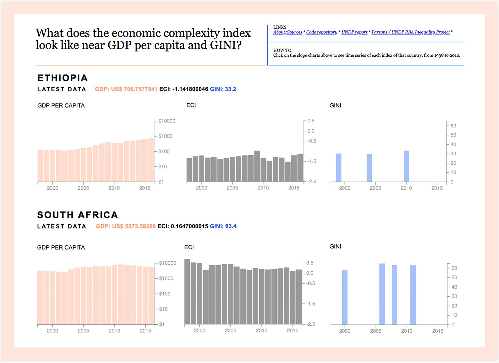
The visualization has two features: it uses a slopegraph to see how the GDP per capita, ECI and GINI are connected in a country. It also shows, as a secondary feature, the time series for each of of those indexes for the Country selected.

Methodology
The slopegraph has 3 steps; 1st, the GDP per capita; 2nd, the ECI; 3rd, GINI. The vertical position of the corners of each line was normalized to the axis height.
When the user clicks on one of the slopes, a histogram for that specific country and its indexes for the last 24 years loads on the left side.
More info here
Roles
-
Coding: The visualization was rendered with D3.
Assignment for Major Studio 01 - Parsons 2017.